Where's my Voi scooter: [8] Creating Heatmap for distribution of scooters
![Where's my Voi scooter: [8] Creating Heatmap for distribution of scooters](/_next/image?url=https%3A%2F%2Fcdn.hashnode.com%2Fres%2Fhashnode%2Fimage%2Fupload%2Fv1658409084389%2FTX4wEmzRs.png&w=3840&q=75)
In this blog, I aim to investigate the distribution of scooters.
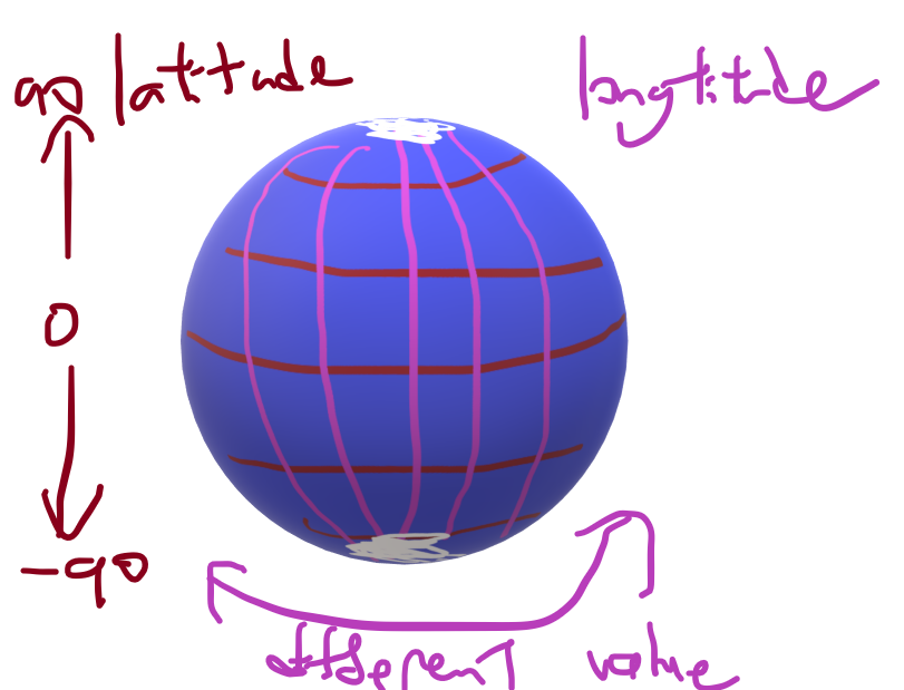
Finding out the latitude and longitude of my city
Scooter data uses latitude and longitude to store where they are. Latitude and longitude are a way to represent where something is in the world by how far it is from the equator and the prime meridian.
Heatmap
I aim to use a heat map to plot the concentration of the scooters. Heat maps show which part of the map is hot. It is used for three-dimensional data where the x and y axis are for the first two dimensions, and the colour (heat) is for the third. In my case, the x and y axis will be used for the latitude and longitude, and the colour will represent how many scooters are in that area.
Changing data representation
Currently, my scooter location data is split into two dataframe, one for latitude and one for longitude. I want to get all the scooter locations from a timestamp, so I will get the data from the same row from both dataframes.
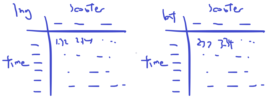
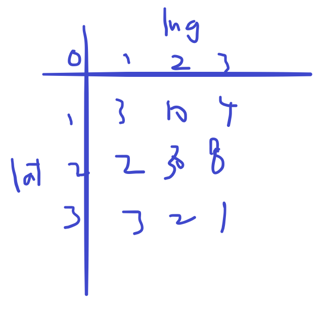
Then I will fill the data into a dataframe where the latitude and the longitude are the two axes, and the value in the middle means how many scooters are in that coordinate range. So I want to find the 4 corners of the city where there are scooters, so I know how to set the range for the latitude and longitude.
Fixing floating point precision using string formatting
Then I turn the four corners into a range, I use the np.arange() function, however, due to the precision problem of floating point numbers, the numbers are not accurate.
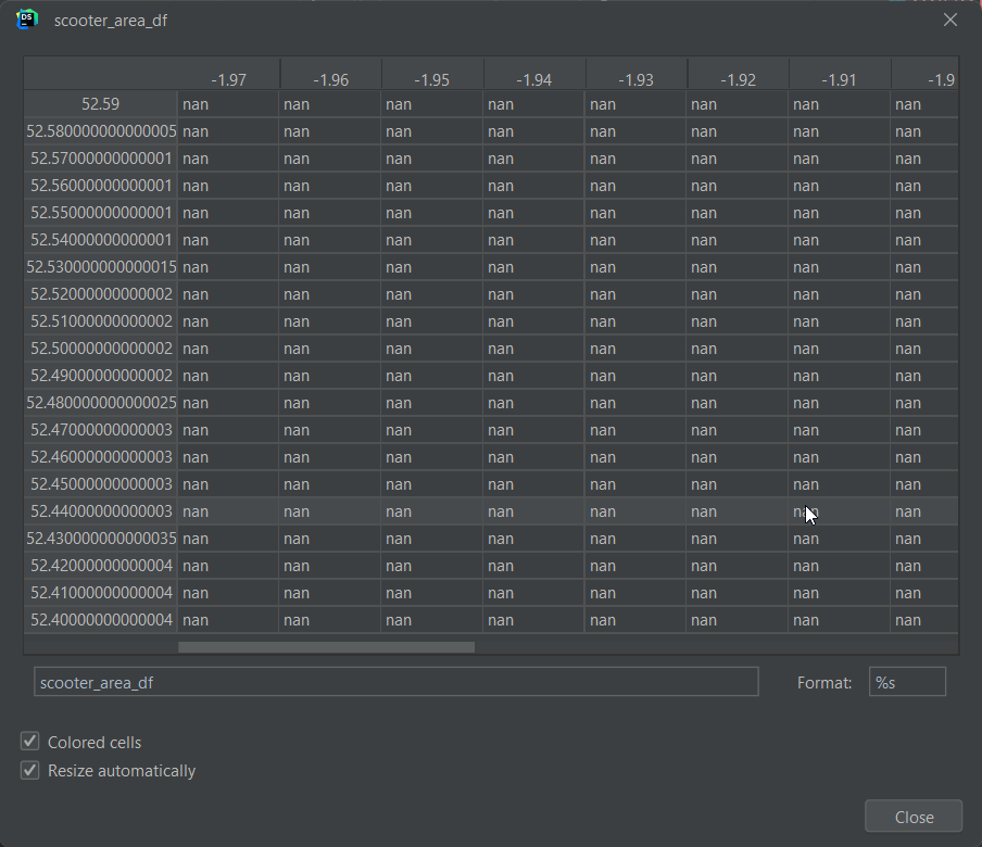
list(np.arange(52.59, 52.40, -0.005))
the output is, [52.59, 52.585, 52.58, 52.574999999999996, 52.56999999999999,...
And the dataframe looks like this
Therefore I used string formatting and list comprehension to turn this list of floating point numbers into a string, which doesn't have the problem of precision.
lat_index = np.arange(52.59, 52.40, -0.005)
str_lat_index = ["%.3f" % i for i in lat_index]
Creating the dataframe
Now I can create the dataframe from the str index and column, I used fillna(0) because at first of creating the dataframe, all values are null values, and since I am counting the number of scooters, everything should be 0 at the beginning.
scooter_area_df = pd.DataFrame(index=str_lat_index, columns=str_lng_column, dtype=np.int64).fillna(0)
Filling the dataframe
Then I extracted the specific row from the dataframe, for the starting index, I took the value at 2022-06-25 at 5 am.
df_starting_index = 26852

latitude_df_row = latitude_df.iloc[df_starting_index]
longitude_df_row = longitude_df.iloc[df_starting_index]
And I fill in the scooter_area_df by going through the latitude dataframe and longitude dataframe, fetching the value from both of them and incrementing the particular cell in the scooter_area_df. Notice that I used the lazy approach, which is to round down the data to the nearest 2 decimal point, this is not accurate because what I should have down is to round up/down depending which one is closer.
for lat, lng in zip(latitude_df_row, longitude_df_row):
    try:
        if not pd.isnull(lat):
            str_lat = "%.2f" % lat
            str_lng = "%.2f" % lng
            scooter_area_df.loc[str_lat, str_lng] += 1
    except KeyboardInterrupt:
        break
    except:
        traceback.print_exc()
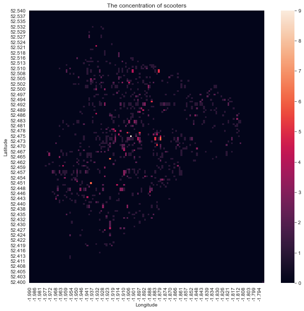
Plotting the graph
I then plot the graph using the seaborn library and add the appropriate labels to it.
fun fact: We usually import seaborn as sns because Samuel Norman "Sam" Seaborn is a fictional character portrayed by Rob Lowe on the television serial drama The West Wing.
import seaborn as sns
fig, ax = plt.subplots(figsize=(12, 10))
fig.patch.set_facecolor('white')
ax = sns.heatmap(scooter_area_df, square=True)
plt.xlabel("Longitude")
plt.ylabel("Latitude")
plt.title("The concentration of scooters")
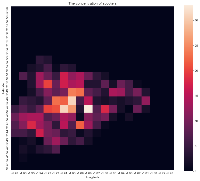
Problems with the current plot
This result is not desirable because:
- The squares are too big, I wish we could be more precise
- It may not be geographically accurate, as 1 latitude is usually not as long as one longitude, ideally the heatmap will look the same as if it is plotted on an actual map.
Problem 1: being more precise
To do this, How much we decrease the square size matters a lot, because if we decrease it too much. If there is a bunch of scooters next to each other, they might be separated into different areas, and we cannot see how concentrated they are.
The following is an example of what happened if we decreased the step, which is the square size, by 10 times, you can hardly see the dots.
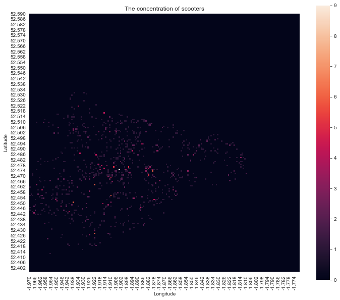
So I need to find an appropriate amount to decrease the step.
Problem 2: the actual ratio of the map
To do this, I plan to measure the relationship between the distance between the two points, and the differences in latitude and longitude.
The horizontal distance is 13.53 km, and the longitude difference is 0.2
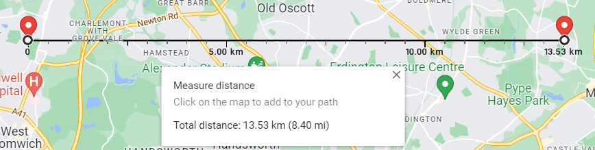
The vertical distance is 15.57 km, and the latitude difference is 0.14
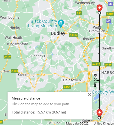
So let's say if I want each square to be 100 meters, then the vertical step will be 0.14/155.7, and the horizontal step will be 0.2/135.3.
Find the closest value in a sorted array
Previously, I took the lazy route and just used string formatting to do the rounding, but since now the intervals are not multiple of 10, I need to find a new way. I aim to find which value from the vertical range or horizontal range is the closest to the value, so a binary search should be useful.
I copied the code from this stackoverflow answer, which uses the bisect library for a quick way to find the nearest result, the code looks like this:
from bisect import bisect_left

def take_closest(myList, myNumber):
    """
    Assumes myList is sorted. Returns closest value to myNumber.
    If two numbers are equally close, return the smallest number.
    """
    pos = bisect_left(myList, myNumber)
    if pos == 0:
        return myList[0]
    if pos == len(myList):
        return myList[-1]
    before = myList[pos - 1]
    after = myList[pos]
    if after - myNumber < myNumber - before:
        return after
    else:
        return before
I also changed the code to fit the code that updates the value inside the scooter_area_df, notice that I used lat_index_reversed, since take_cloest only works on an ascendingly sorted array, I had to make a reversed latitude array to make it work, take_cloest returns a value instead of an index, so I don't have to modify the returned value.
str_lat = "%.3f" % take_closest(lat_index_reversed, lat)
str_lng = "%.3f" % take_closest(lng_column, lng)
scooter_area_df.loc[str_lat, str_lng] += 1
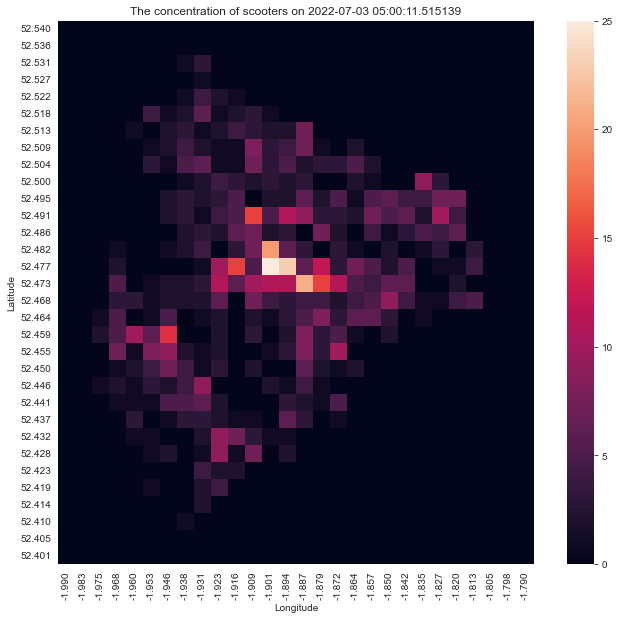
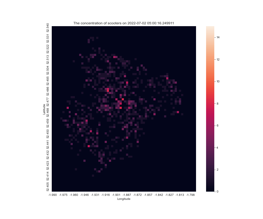
now the heatmap looks like this, which when looking at the Voi app, is very similar to how my city looks
Turning it all into a function
I now made plot_concentration_of_scooters a function, in which I first get the two dataframes outside of the function so it will only be called once, then declare where latitude and longitude start and end.
import seaborn as sns

longitude_df = store['longitude_df']
latitude_df = store['latitude_df']

lat_start_index = 52.54
lat_end_index = 52.40

lng_start_index = -1.99
lng_end_index = -1.79
Then I calculate the vertical step and horizontal step, create the ranges, make the scooter area dataframe, fill it, and plot the result.
def plot_concentration_of_scooters(df_index, square_side_in_meters):
    lat_step = (lat_end_index - lat_start_index) / (15.57 * 1000 / square_side_in_meters)
    lng_step = (lng_end_index - lng_start_index) / (13.53 * 1000 / square_side_in_meters)

    lat_index = np.arange(lat_start_index, lat_end_index, lat_step)
    lat_index_reversed = lat_index[::-1]
    str_lat_index = ["%.3f" % i for i in lat_index]

    lng_column = np.arange(lng_start_index, lng_end_index, lng_step)
    str_lng_column = ["%.3f" % i for i in lng_column]

    scooter_area_df = pd.DataFrame(index=str_lat_index, columns=str_lng_column, dtype=np.int64).fillna(0)

    latitude_df_row = latitude_df.iloc[df_index]
    longitude_df_row = longitude_df.iloc[df_index]

    for lat, lng in zip(latitude_df_row, longitude_df_row):
        if not pd.isnull(lat):
            str_lat = "%.3f" % take_closest(lat_index_reversed, lat)
            str_lng = "%.3f" % take_closest(lng_column, lng)
            scooter_area_df.loc[str_lat, str_lng] += 1

    fig, ax = plt.subplots(figsize=(12, 10))
    fig.patch.set_facecolor('white')
    ax = sns.heatmap(scooter_area_df, square=True)
    plt.xlabel("Longitude")
    plt.ylabel("Latitude")
    plt.title(f"The concentration of scooters on {longitude_df_row.name}")
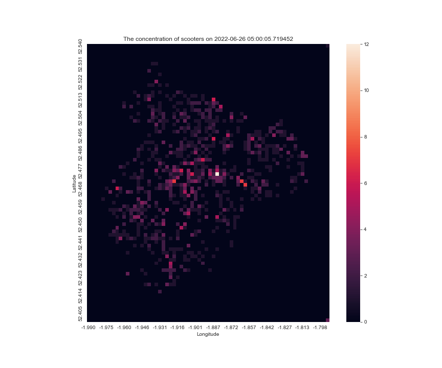
here is what happens when I use different values
plot_concentration_of_scooters(38339, 500)
Making multiple results into a gif
With a still frame, I can only tell the distribution in a static manner, what if I want to show the change over time? I want to make a gif to show the change, like in a day.
I found this article that is really helpful, it talks about how to make multiple plots into a graph.
What I came up with is to have a temporary folder, then I plot each graph, after that saving them with plt.savefig(), and then using the imageio library to turn them into a gif file, after that deleting the temporary plot images.
import imageio

def make_scooter_concentration_gif(df_start_index, df_end_index, step, square_size_in_meters):
    temp_folder = Path('temp/scooter_concentration_gif/')
    df_index_range = range(df_start_index, df_end_index, step)
    for df_index in df_index_range:
        plot_concentration_of_scooters(df_index, square_size_in_meters)
        plt.savefig(temp_folder.joinpath(f'{df_index}.png'))
        plt.close()

    with imageio.get_writer('graphs/mygif.gif', mode='I', duration=1) as writer:
        for df_index in df_index_range:
            image = imageio.imread(temp_folder.joinpath(f'{df_index}.png'))
            writer.append_data(image)

    for df_index in df_index_range:
        temp_folder.joinpath(f'{df_index}.png').unlink()
the result of make_scooter_concentration_gif(28288, 29304, 100, 200) is

Improving the function
This is good, but one that I have against it is that it loops too quick and it is hard to tell when is the graph ending, I can either change the loop variable for the gif to make it not loop, or I can add a blank frame at the end so the users know if a new cycle begins, I prefer the latter solution.
Also, in each image, the scale for the anchor the colourmap is different, sometimes the max is 20, sometimes 10, so it is hard to tell for a single pixel, whether it is gaining scooters or not, so I modified the code the have a vmax argument, to fix the maximum for the scale.
the result looks like this make_scooter_concentration_gif(28288, 29304, 100, 200)
at another day make_scooter_concentration_gif(36903, 37920, 60, 200, 15)
Final version of the code for reference
def plot_concentration_of_scooters(df_index, square_side_in_meters, vmax=None):
    lat_step = (lat_end_index - lat_start_index) / (15.57 * 1000 / square_side_in_meters)
    lng_step = (lng_end_index - lng_start_index) / (13.53 * 1000 / square_side_in_meters)

    lat_index = np.arange(lat_start_index, lat_end_index, lat_step)
    lat_index_reversed = lat_index[::-1]
    str_lat_index = ["%.3f" % i for i in lat_index]

    lng_column = np.arange(lng_start_index, lng_end_index, lng_step)
    str_lng_column = ["%.3f" % i for i in lng_column]

    scooter_area_df = pd.DataFrame(index=str_lat_index, columns=str_lng_column, dtype=np.int64).fillna(0)

    latitude_df_row = latitude_df.iloc[df_index]
    longitude_df_row = longitude_df.iloc[df_index]

    for lat, lng in zip(latitude_df_row, longitude_df_row):
        if not pd.isnull(lat):
            str_lat = "%.3f" % take_closest(lat_index_reversed, lat)
            str_lng = "%.3f" % take_closest(lng_column, lng)
            scooter_area_df.loc[str_lat, str_lng] += 1

    fig, ax = plt.subplots(figsize=(12, 10))
    fig.patch.set_facecolor('white')
    ax = sns.heatmap(scooter_area_df, square=True, xticklabels=5, yticklabels=5, vmax=vmax)
    plt.xlabel("Longitude")
    plt.ylabel("Latitude")
    plt.title(f"The concentration of scooters on {longitude_df_row.name}")
import imageio

def make_scooter_concentration_gif(df_start_index, df_end_index, step, square_size_in_meters, vmax=None):
    temp_folder = Path('temp/scooter_concentration_gif/')
    df_index_range = range(df_start_index, df_end_index, step)
    for df_index in df_index_range:
        plot_concentration_of_scooters(df_index, square_size_in_meters, vmax=vmax)
        plt.savefig(temp_folder.joinpath(f'{df_index}.png'))
        plt.close()

    with imageio.get_writer('graphs/mygif.gif', mode='I', duration=1) as writer:
        for df_index in df_index_range:
            image = imageio.imread(temp_folder.joinpath(f'{df_index}.png'))
            writer.append_data(image)
        writer.append_data(imageio.imread('temp/scooter_concentration_gif/blank.png'))

    for df_index in df_index_range:
        temp_folder.joinpath(f'{df_index}.png').unlink()
What's next
For the next blog, I aim to incorporate the map into the plots, like making the map as a background image in the heatmap or plotting the scooters at dots on the map.
![Focuster review: My experience as a student in summer [week 3]](/_next/image?url=https%3A%2F%2Fcdn.hashnode.com%2Fres%2Fhashnode%2Fimage%2Fupload%2Fv1693222238382%2F06452c01-14a3-423a-9311-83b9d82f6fcc.png&w=3840&q=75)
![Reclaim.AI review: My experience as a student in internship [week 2]](/_next/image?url=https%3A%2F%2Fcdn.hashnode.com%2Fres%2Fhashnode%2Fimage%2Fupload%2Fv1692385558997%2F5cd2253e-b50d-4d47-9aad-72807848b1a9.png&w=3840&q=75)
![Motion Review: My experience as a student in internship [week 1]](/_next/image?url=https%3A%2F%2Fcdn.hashnode.com%2Fres%2Fhashnode%2Fimage%2Fupload%2Fv1690840123756%2F5bdf844a-d728-430c-8d9b-b88b7b77c726.png&w=3840&q=75)
![Trialling Productivity Tools to Rescue My Time [Week 0]](/_next/image?url=https%3A%2F%2Fcdn.hashnode.com%2Fres%2Fhashnode%2Fimage%2Fupload%2Fv1690321356599%2F2f404dbe-3c2a-421b-903c-04d72c8febed.png&w=3840&q=75)